
-
How to Make Your Website Mobile-Friendly
A Mobile friendly website makes it much easier for users to navigate and read the content on various mobile devices, smart phones and tablet devices. A mobile friendly website must include the features found on a standard website, such as navigation, search options, and share functions. Having a separate mobile site from your desktop site allows you to optimize for speed, which is paramount for mobile. In this blog post, we are going to help you to mobilize your website, so that your business can start benefiting from its mobile traffic instead of turning it away.
What is a Mobile Friendly Website?
As the name indicates, a mobile friendly website is a site which gives the best experience for user, no matter which mobile device they use.
Characteristics of a mobile friendly website:
-
-
Navigation has been simplified and clearly laid out to make page selection easy
-
-
Design elements have been compressed, replaced or removed to simplify usage
-
-
Content has been laid out to allow for mobile consumption
-
-
Phone numbers are setup for click to call functionality
-
-
Addresses are setup to use the device’s map functionality
-
-
Calls to action are setup to work with simple forms or the device’s email functionality
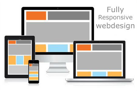
Use a Responsive website design on CMS:
Mobile users have different needs and wants than desktop users, and the design of the site should reflect that. Great mobile design is a lot more than having legible text and properly sized images. Responsive design allows website developers to create a site that can be viewed easily on different devices. Responsive design furnishes the best possible experience at the mobile level but allows for enhancements to the site’s design and functionality as it increases in screen size. Responsive design uses CSS3 to automatically adapt website content to the size of the user’s screen based on width, orientation and resolution.
This reduces the amount of work which developers have to do when it comes to develop a website. The responsive design approach makes use of flexible layouts, flexible images, and cascading stylesheet media queries. When responsive design is used on a website, the web page will be able to recognize the visitor’s screen size and orientation and change the layout accordingly. Responsive website content such as images and text will automatically shift around to be easier to navigate, depending on the mobile device used.
Build a responsive website using frameworks like Bootstrap/ Foundation:
Bootstrap is a responsive framework for building web sites and applications, and it’s a great starting point for building a responsive theme for your website. Using Bootstrap, the development of responsive website is more easier. Bootstrap editors and builders makes it easier to prototype, test and build responsive websites. Let us have a look at some of the Bootstrap tools which helps to create responsive interfaces and websites faster than ever.
Brix.io:
Brix is a powerful online Bootstrap tool that enables you to create responsive interfaces & websites faster than ever. Brix produces easily readable, smooth and well-formatted HTML, CSS & JS for use with any hosting service or other editor.
Jetstrap
Jetstrap is a premium web-based interface building tool for Bootstrap 3 that helps developers and designers to build for all devices and allows to work from anywhere.
Divshot
Divshot is not only a visual Bootstrap editor, but also an application-grade hosting environment built for developers.
Bootstrap Starter Kit:
Bootstrap Starter Kit is a Bootstrap template with a compilation of unique, professional Content Blocks, that can be composed together to develop unlimited responsive layouts to suit any business. Use the drag-and-drop HTML Builder to quickly and visually create your perfect site, or copy-and-paste your chosen blocks for greater control.
Foundation:
Foundation is a family of responsive front-end frameworks which helps to build beautiful responsive websites, apps, prototypes and emails that look amazing on any device. Foundation is easier to style, faster to learn, modular, semantic, readable, flexible, and completely customizable, so you can easily build your responsive website from prototype to production in no time. Foundation supports Right-to-Left(RTL) languages to help designers around the world to design great products faster.

Build a separate mobile version of your website:
If you build a mobile version of your website, you will effectively have two websites – one for desktop and one suitable for mobile devices. When the users visit your website using a mobile device, they will be redirected automatically to your mobile website. With a separate mobile website, you can have different content, layout, images, etc. on the site.
Advantages :
-
-
With a separate site, you can tailor the content to the needs of your mobile readers that won’t be replicated on the desktop version of your website.
-
-
It is inexpensive to build.
Include viewport meta tag:
The viewport is a virtual area used by the browser rendering engine to determine how content is scaled and sized. Without viewport, your site will not work well on a mobile device, because the viewport meta tag makes each page to fit exactly inside the screen of the mobile device. Include the below given meta tag at the head of the document.
Use high-resolution images:
High resolution images are very important on your responsive website to make sure that your user’s experience is of a high standard. Having extremely high-resolution images will help you avoid blurry images when viewed on a retina-quality screen.
Optimize Image Size:
Mobile friendliness isn’t just about having a beautiful website design. The major part is about enhancing the user’s experience, and the load times of images. When you’re dealing with mobile devices, make sure that you design the images which have the smallest possible file size. Smaller size images will look crisp and clear on whatever screen it’s being viewed on and it helps to load the page faster, and generally contributes to a positive image of your site. Another reason is, the bandwidth of mobile devices are much smaller when compared to desktop’s and it causes increased loading times.
Use high-resolution images:
High resolution images are very important on your responsive website to make sure that your user’s experience is of a high standard. Having extremely high-resolution images will help you avoid blurry images when viewed on a retina-quality screen.
Check the font size and button size:
Font size and button sizes matter a lot for mobile devices. Font size should be at least 14px. This may seem big, but instead of having your users zoom-in to read the content, this makes it easier for them by adjusting your font size for maximum legibility. Only on labels or forms, you can go with a minimum of 12px.
Always go with bigger button sizes, because it reduces the chances that the user will click the wrong button by mistake.
Remove the default zoom:
Default zoom (auto-zoom) will always mess up the layout elements. Images and the navigation content, may not work properly using the auto-zoom feature, since they may appear too small or too large in your layout.
To avoid this, use the “viewport” meta tag to set up custom variables within the content and ensure that you include the tag in your HTML.
Don’t Block Javascript, CSS, or Image Files:
Javascript is a widely used language and together with CSS and image files, it’s one of the backbones for a responsive, mobile-friendly site. Try to make your website universally compatible i.e. it should display your website from any device that people would like to view it on i.e. using software and coding that are accepted universally. The more focused something is, the less likely your site will be compatible all around.
Use Mobile Plugins on Popular CMS Platforms:
The most popular website content management systems — WordPress, Joomla, or Drupal can make any website mobile-friendly, without adding two different versions.
WordPress Mobile Plugins:
WPtouch is one of the best plugins for WordPress websites which likes to add a custom mobile experience. It provides a paid version that contains added benefits for ecommerce sites. JetPack is WordPress.com’s solution for implementing a simple mobile theme to ensure mobile access to its websites.
Joomla Mobile Plugins:
Responsivizer and JoomlaShine plugins have simple ways to add mobile functionality to your Joomla website. These are essential only if you use an older version of Joomla, such as 2.5 or lower. Joomla 3.x comes with default support for mobile websites.
Drupal Mobile Plugins:
Drupal offers two modules — ThemeKey and MobileTheme — that checks whether a user is on a mobile device and it automatically re-directs the theme of the website to a mobile friendly appearance. All the above mobile plugins offer easy-to-use interfaces once you get them installed.
Mobile SEO:
Mobile Search Engine Optimization is the method of developing a website to make it appropriate for looking on mobile devices of different screen sizes. Mobile search engine optimization (SEO) ensures that your website appears in mobile search engine results, and that users who access your website through a mobile device have an optimized experience.
Why Mobile SEO?
-
-
Mobile media has surpassed desktops
-
-
People are attached to their phones.
-
-
Mobile users shop extensively for products and services.
A website is considered as mobile friendly if it has the following characteristics:
-
-
A good mobile website has a responsive design which performs well on desktops as well as mobile devices. It not only reduces the maintenance of the website but also makes the content consistent for the search engines.
-
-
The contents of an excellent mobile website are easy to read on a mobile device without having to zoom the screen. It has appropriate fonts, colors, and layouts.
-
-
It is easy to navigate through a good mobile website on a small screen. It provides links and buttons that can be clicked easily using a finger.
-
-
A good mobile website must be lightweight i.e. it should takes less bandwidth and time to load on mobile networks.
-
-
The Home Page of a mobile website plays the most important role in connecting users to the content which they are looking for. Therefore, a good mobile website must display the most important links on the Home Page, so that they can get enough visibility.
-
-
A website’s ranking depends on how user friendly it is. So, in-order to increase the ranking of your website , make sure that your website is user friendly.
Best Practices for Mobile Optimization:
Design for maximum usability:
-
-
Use text that is large enough to read without zooming
-
-
Make sure that the users do not have to scroll horizontally to see your content on a mobile device
-
-
Make sure clickable links are not too close to each other, making it hard for users to click the right link
Use schema.org structured data :
With minimal space on the screen, search results that include rich snippets will look more appealing.
Optimize images and videos:
-
-
Use HTML 5 instead of flash.
-
-
For the best user experience, ensure that the videos play perfectly, and that no image elements overlap each other.
Use clear calls to action:
-
-
Text calls to action are very tricky to click, and can result in poor results.
-
-
Make your calls to action highly click-able by using buttons, color differentiation, custom graphics, images, etc.
Improve page load speed:
Page speed is more essential for mobile than desktop devices due to hardware and connectivity problems. Improve page speed by minimizing the code and reducing the image file sizes A one second delay in page response can result in a 7% reduction in conversions
Avoid popup ads:
Popup ads can annoy the visitors, and can lead to a higher bounce rate.
Use videos on your website:
Using YouTube videos on your website is a solution to combat any complexities in viewing videos on mobile. The reason behind this is that, the embed code of YouTube is responsive already, and this will revive multiple steps to ensure that your videos are mobile-friendly.
Don’t oblige your user’s mobile experience:
No matter how elegant your mobile website is, always add “go to full website” or “view desktop version” option at the bottom of your website, because few users will always prefer to have full site experience.
Conclusion
We hope these guidelines will help you to know how to make your website more mobile-friendly.
Posted by admin Posted on 2016-12-12 -
Drop us a line
Please correct the following errors and try again:
Post Comments 0